System Elements
As Kettering Health evolves to fit the growing needs of our communities, we need a brand identity that brings us together — one that is easy to use, flexible, adaptable — a brand that unites all the people, places, and services that make up Kettering Health. These guidelines cover all the elements that make our brand complete.
Logo
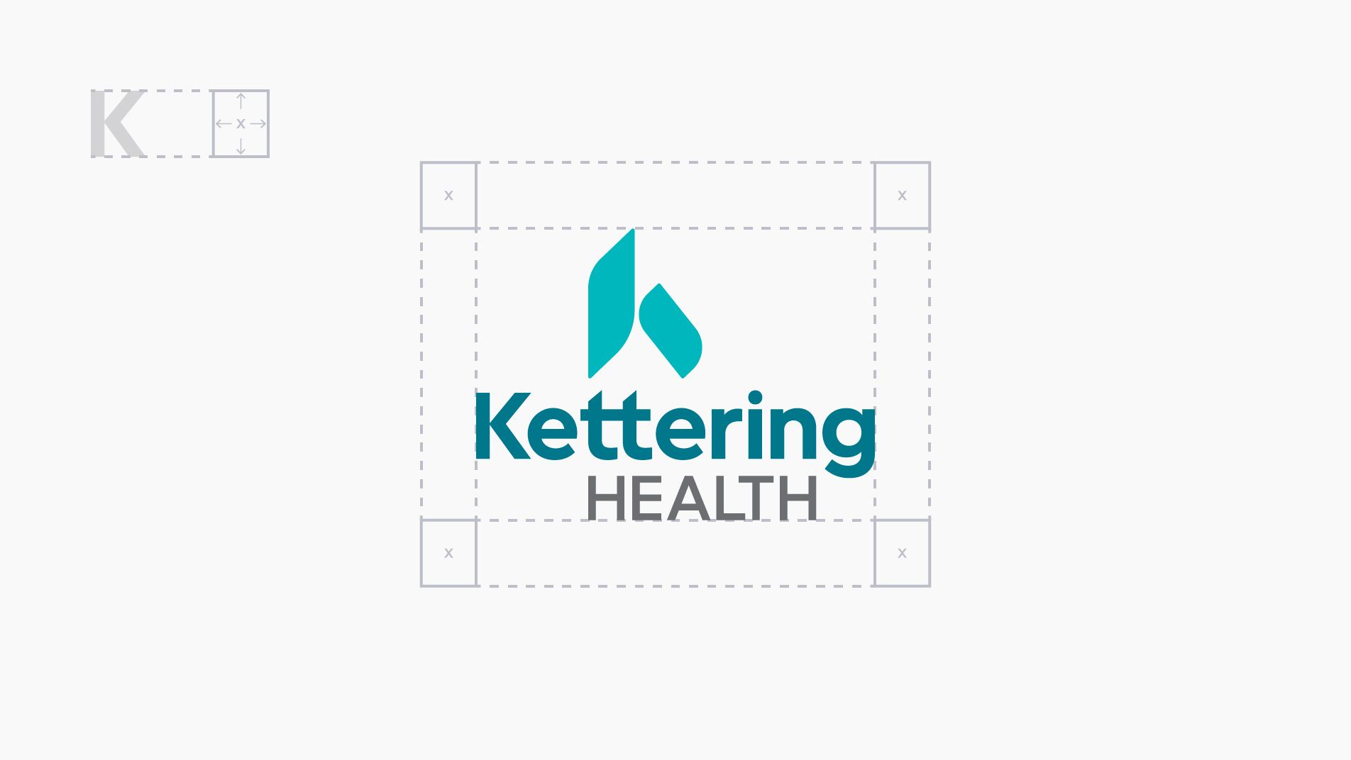
An elevated visual. Well-defined and easy to use, the Kettering Health logo is exemplified by the ‘k’ icon, pointing upward to symbolize the higher purpose we serve and the elevated experience we provide.
Helpful Tips
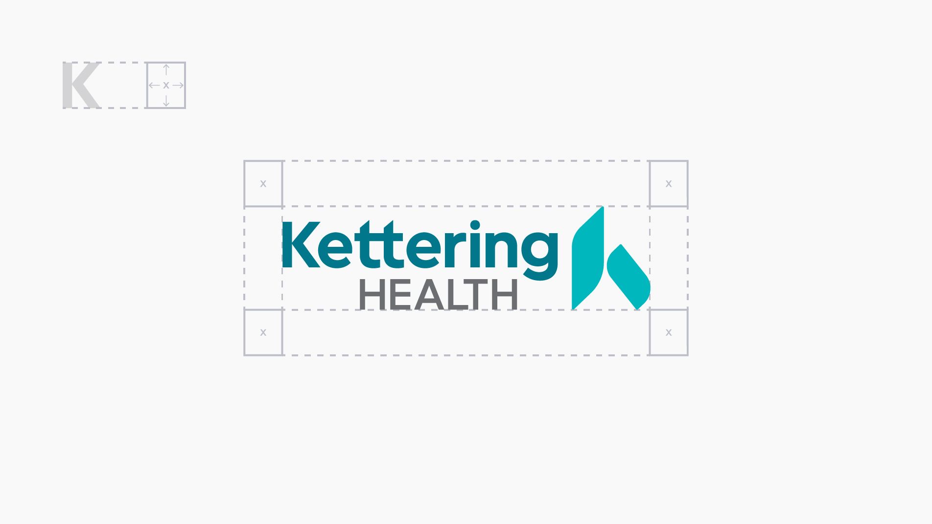
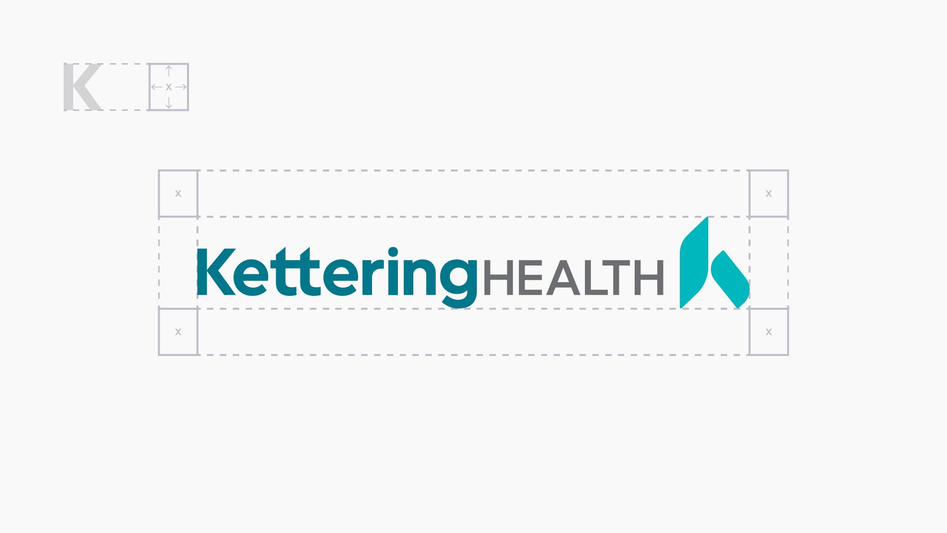
- Three different logo configurations (vertical, horizontal, and long) are available; the configuration that best fits the space should be used.
- When in doubt, choose the logo configuration that allows the Kettering Health name to be as visible as possible.
Tag Line
The following demonstrate the logo locked with the tagline.

Locator
The facility location is set in Kettering Sans SemiBold. Space between the logo and locator is defined by the cap height of the H. For lengthy locator names, the name MUST appear in one line and be used with the long format only.
Logo Color
Our full-color logo is built from three distinguishing brand colors.

Pantone 3145 C
C=100 M=0 Y=24 K=30
R=0 G=119 B=139
#00778b

Pantone 2397 C
C=78 M=0 Y=27 K=0
R=0 G=183 B=189
#00b7bd

Pantone Cool Gray 9
C=0 M=0 Y=0 K=70
R=109 G=110 B=113
#6d6e71
Clear Space
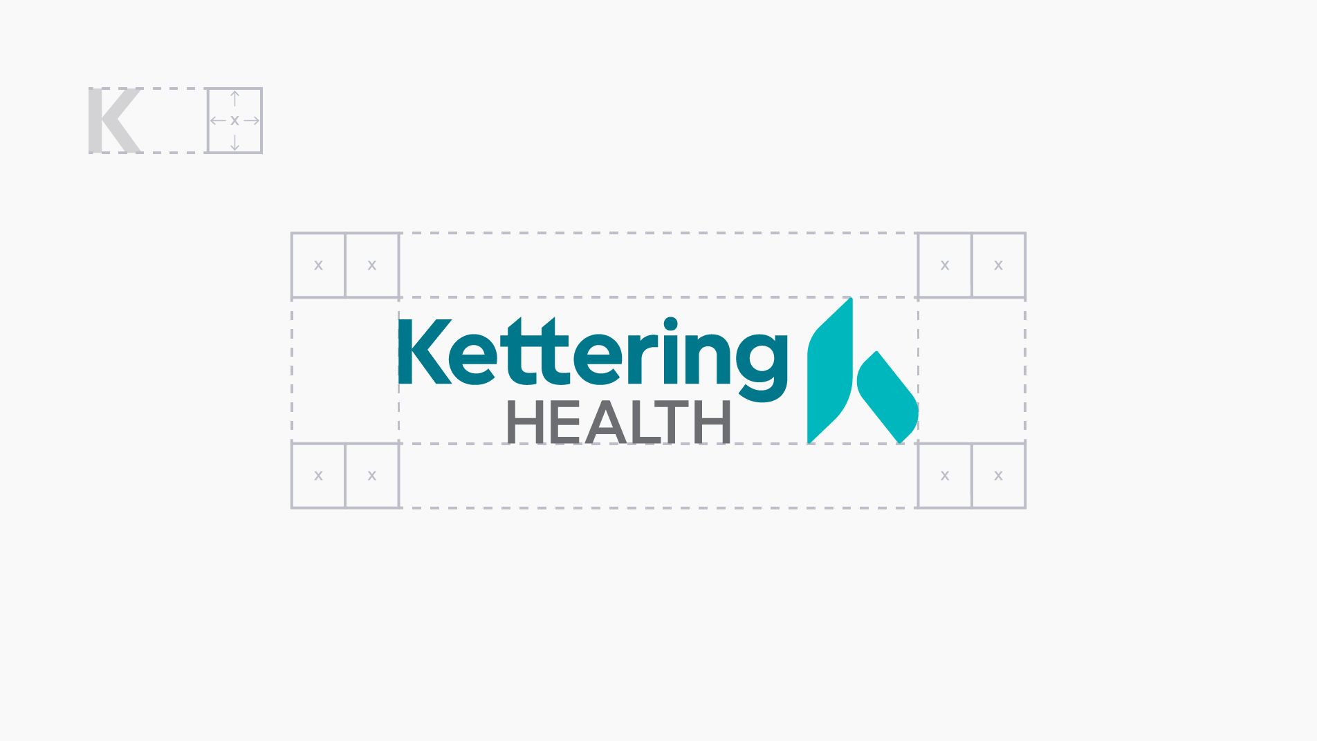
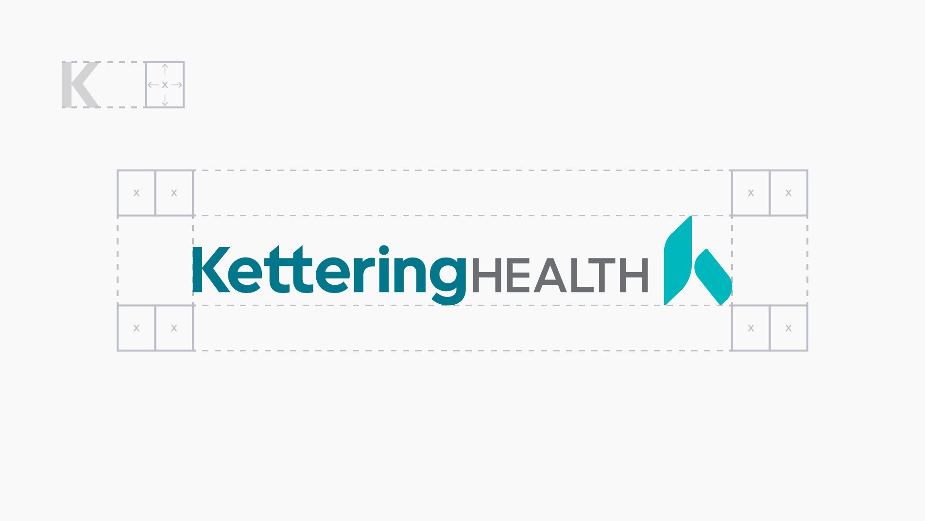
Optimal clear space
Clear space around the logo gives it prominence and legibility. Recommended clear space is defined using the cap height and width of the K.

Minimum clear space
The minimum clear space around the logo is the area that must remain free of all other visual elements, including the edge of the document or surface.
Scale
If the logo is too small to see, it’s too small to use. The following demonstrate the minimum width for each logo format.


Logo Guidance
Accepted uses of the logo

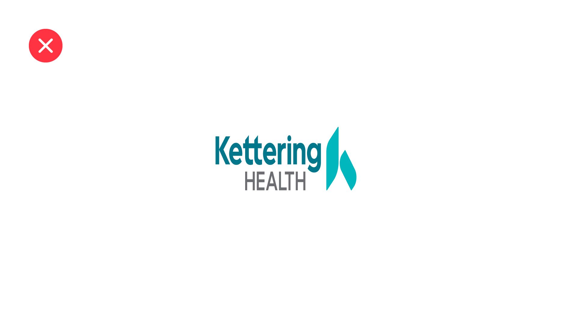
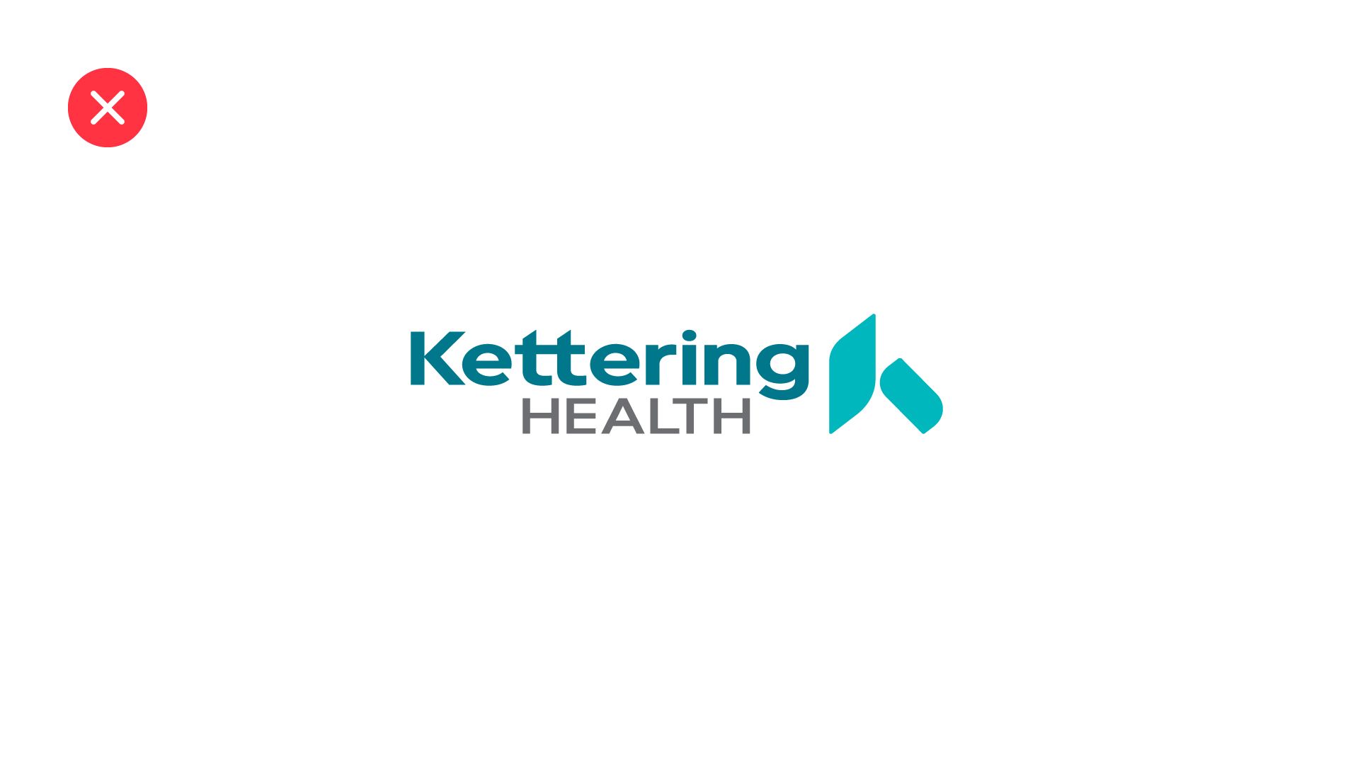
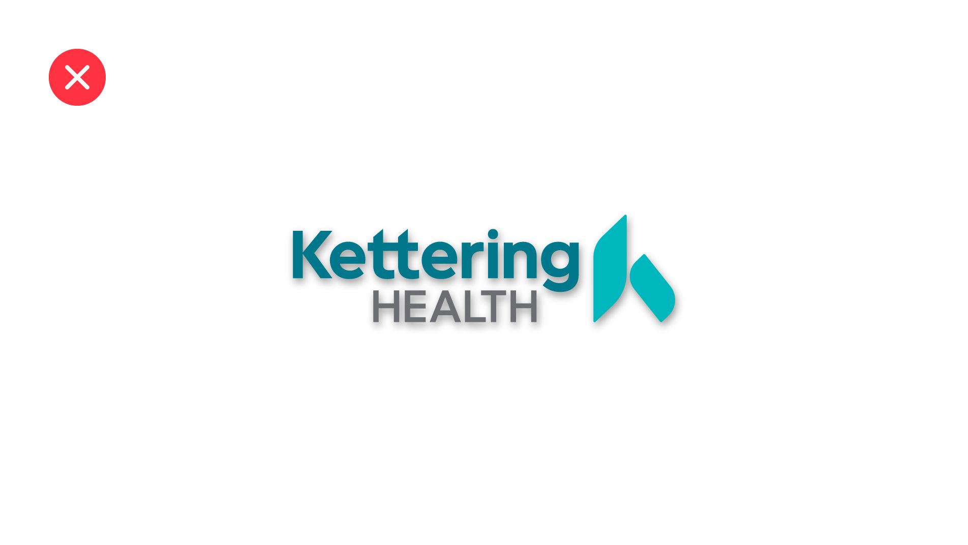
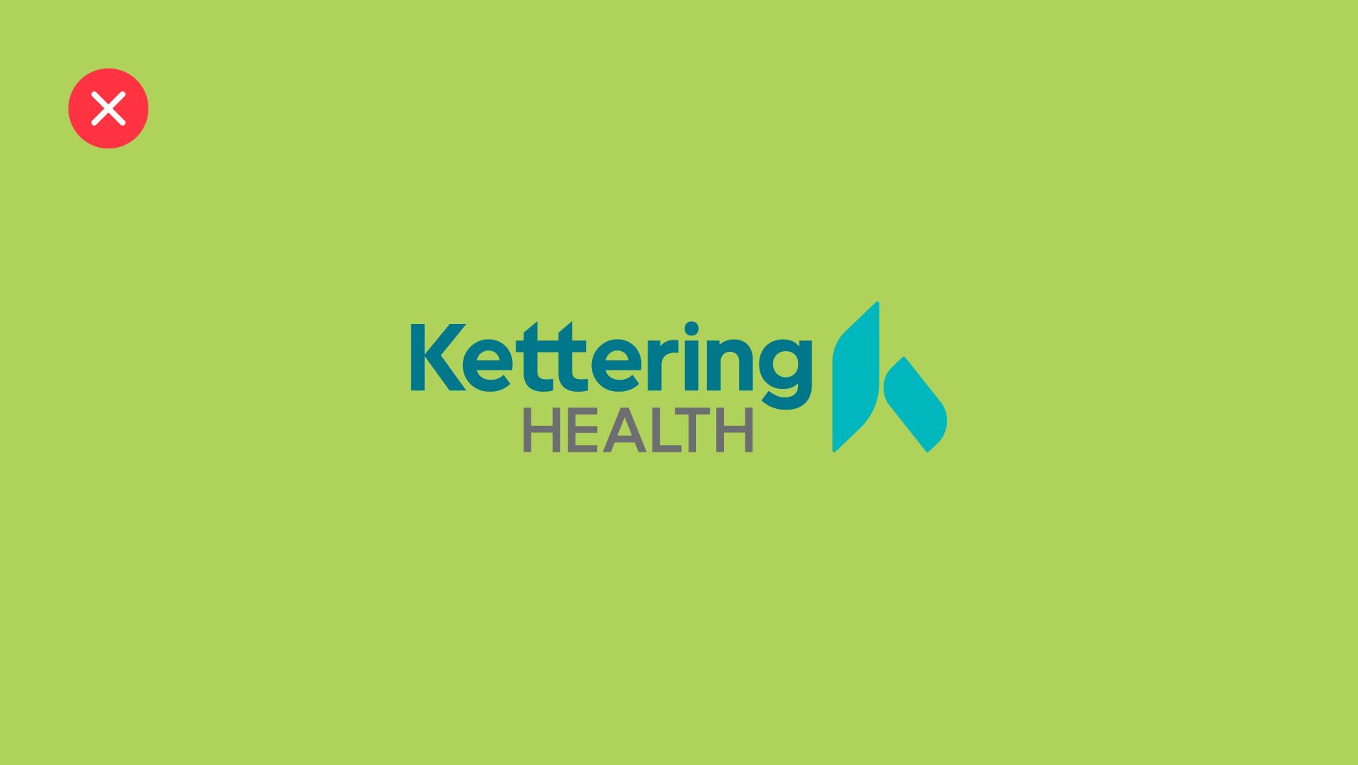
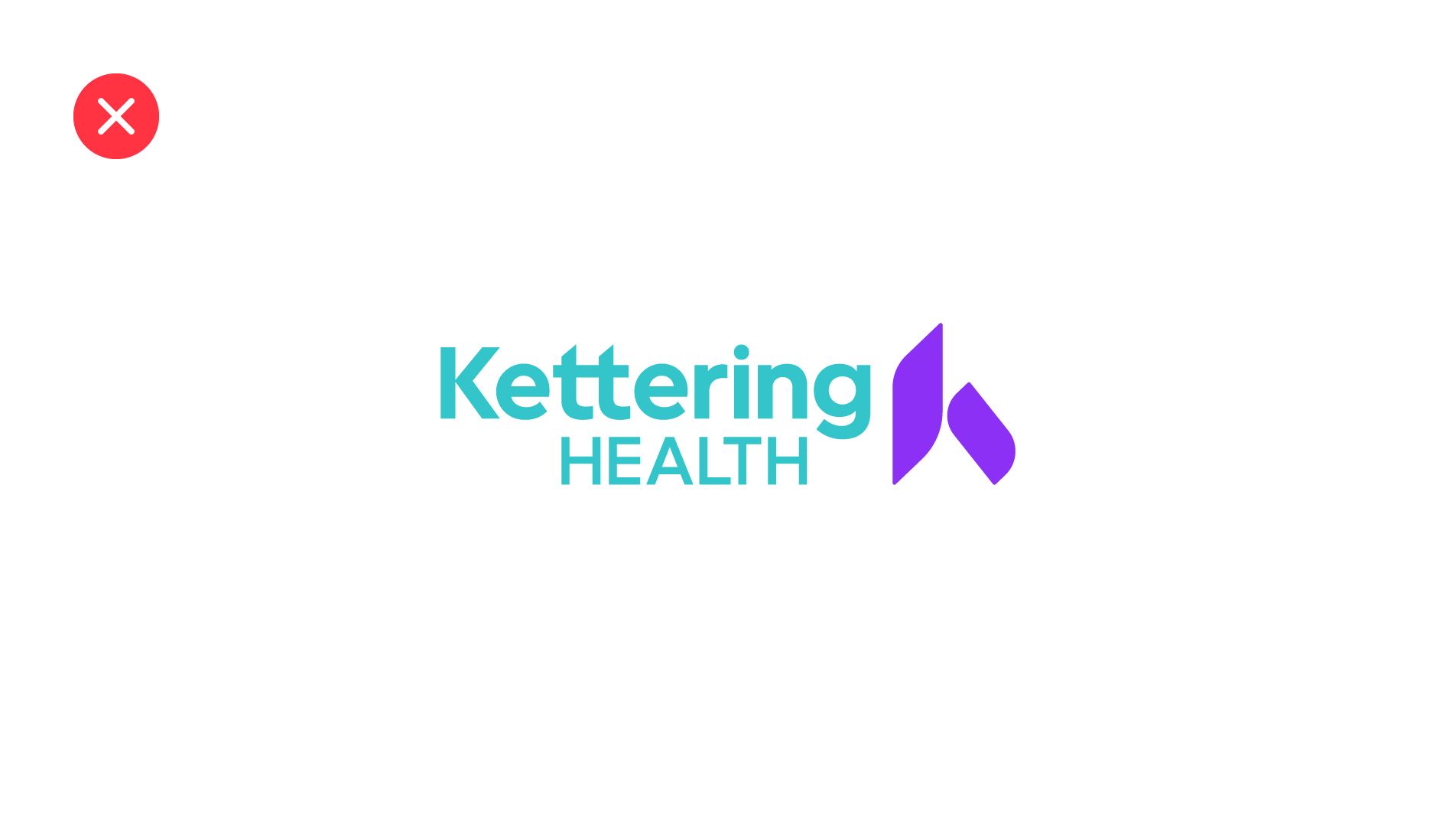
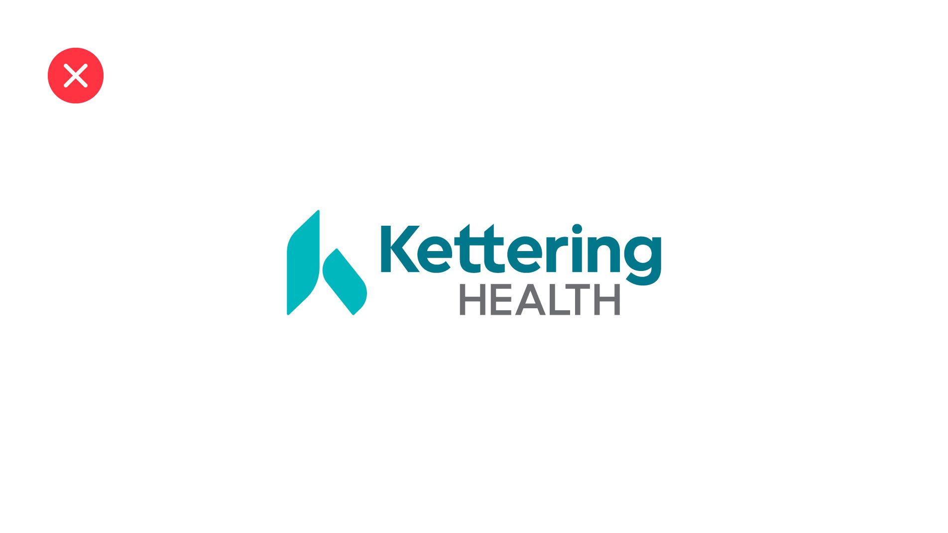
Unacceptable uses of the logo


“k” Icon
The Kettering Health brand icon (the Kettering “k”) is a strong visual representation of our brand. Whether used as part of the logo or as a standalone graphic element, the following guidelines will ensure there is a clear distinction between our iconic “k” and the Kettering Health logo, knowing that one does not work without the other:
- The full Kettering Health logo must be present on the same page or item if the icon is to be used as a standalone graphic.
- The “k” icon is not to be used to substitute the letter “k” in a word.
Helpful Tips
- If there is a question about use of the standalone “k” icon, please contact Marketing and Communications.
- Approval must be given by Marketing and Communications to use the standalone “k” in a manner not outlined in the standards.
Color
A mix of healing greens and calming blues (and everything in between), we let our true colors shine, with a brand color palette that’s as uplifting, friendly, and approachable as we are.
Primary Color

Pantone 3145 C
C=100 M=0 Y=24 K=30
R=0 G=119 B=139
#00778b

Pantone 2397 C
C=78 M=0 Y=27 K=0
R=0 G=183 B=189
#00b7bd

White
C=0 M=0 Y=0 K=0
R=255 G=255 B=255
#ffffff
Secondary Color
Our secondary color palette provides a variety of colors that allow us to tailor the tone to a particular audience, subject or message.

C=70 M=88 Y=0 K=0
R=140 G=48 B=245
#8C30F5

C=97 M=31 Y=11 K=59
R=0 G=72 B=96
#004860

C=27 M=69 Y=0 K=0
R=181 G=101 B=167
#b565a7

C=0 M=95 Y=85 K=5
R=203 G=44 B=48
#cb2c30

C=0 M=20 Y=75 K=0
R=235 G=188 B=78
#ebbc4e

C=0 M=65 Y=100 K=0
R=255 G=106 B=20
#ff6a14

C=0 M=0 Y=0 K=70
R=109 G=110 B=113
#6d6e71
Usage Proportions
It is important to follow the color proportions to maintain brand consistency. Kettering Turquoise, Teal and Classic White should do most of the heavy lifting for brand, while Kettering Purple should assist in a directional capacity. The secondary palette is to be used sparingly in communications that warrant the added differentiation.

Tints and Shades
The specialty colors are designated only for uses that require tone-on-tone pairings or variations of tone and opacity.


Typography
Our brand typography is uniquely Kettering, here to help tell the story of our promise. It is designed to maximize the impact of our messages no matter when or where our audiences may interact with us.
Helpful Tips
- The Kettering Sans typeface appears larger than the application’s selected font size, which means you may have to make adjustments outside of typography standards when choosing the font size that’s appropriate for your use.
- Printing a hard copy is recommended to best judge font size selection.
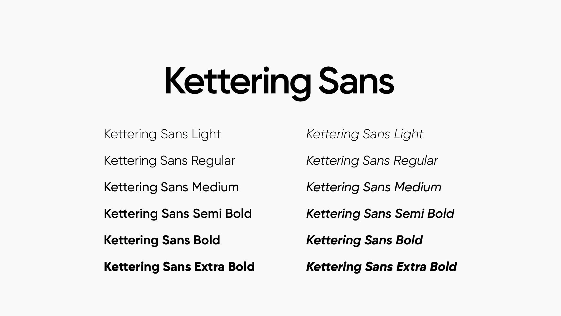
Kettering Sans
Our brand typeface is designed just for us — Kettering Sans: easy to see, easy to use — strong and friendly, just like Kettering.
Hierarchy
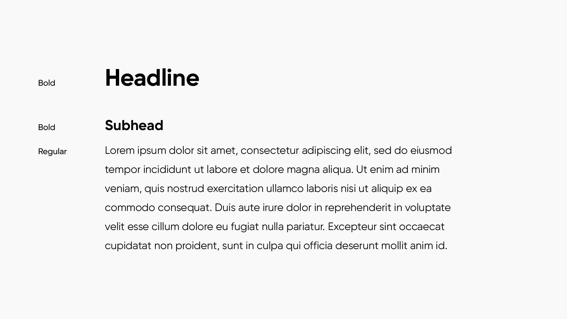
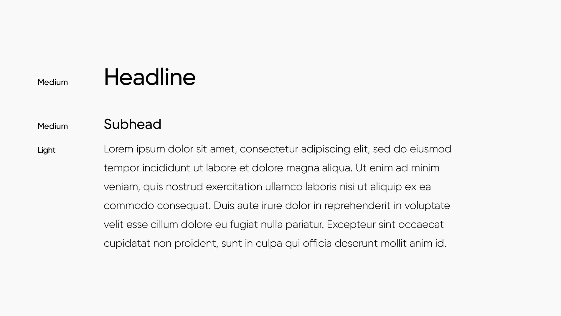
Several weights of Kettering Sans have been identified for use within our visual identity. When selecting type, it is important to maintain proper type pairings to help build a consistent and clear messaging hierarchy.
Alternate Font
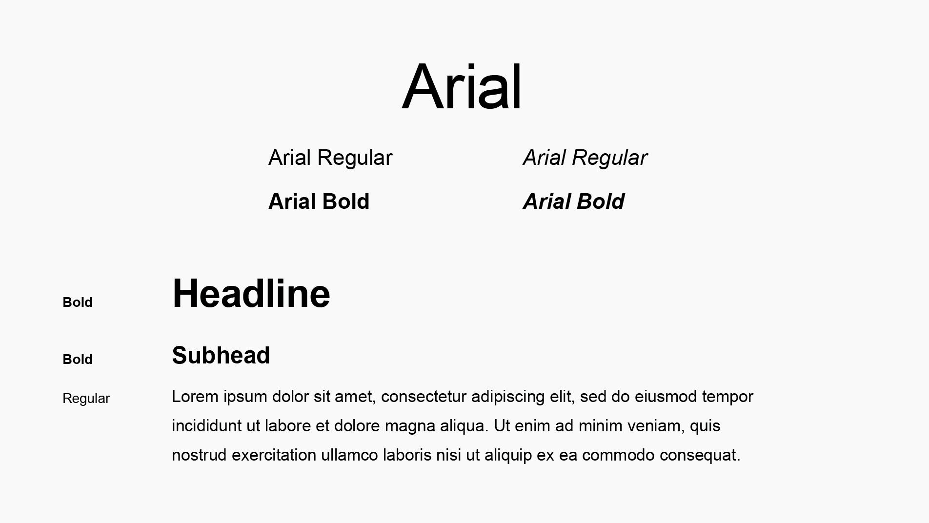
When Kettering Sans is unavailable for use by an application (such as PowerPoint or Word), use Arial in its place. Arial is commonly available on most operating systems.
Photography
By maintaining a strong and consistent brand photography style, we can ensure our brand remains cohesive, visually anchoring our messaging in a genuine and relatable way.
Helpful tips:
- Whether selecting stock or shooting custom photography, always try to subtly incorporate the brand color palette with props or wardrobe selections.
- When custom photography is not possible, opt for high-quality stock photography that follows brand guidelines.
- Use stock photography over clip art where applicable.
Composition Guidance
When selecting or shooting imagery for any brand use, please reference the following guidance:
- Image should feature selective focus, with a shallow depth of field
- Please reference our primary and secondary brand palette when shooting or selecting an image to ensure it features or is tonally compatible with our brand colors.
- Whenever possible, include a dynamic angle or a foreground object for visual interest.
- Image selection should always be mindful of representation and diversity.


Lifestyle Photography
Kettering has a custom image library available for use. Consider choosing custom photos when possible, but know stock imagery is also acceptable when the image library is getting overused.
- Subjects should be healthy, happy and engaged in natural, slice-of-life activities.
- Selected activities should be health-conscious and representative of our brand.
- Photos should appear to be candid — subjects should not be addressing the audience or looking at the camera. Photos should feel authentic and not posed.


Service Line Photography
When selecting or shooting photography related to a specific service line, images should seek to represent the following themes, when appropriate:
- Care Delivery — these images should show compassionate, confident caregivers and positive patient-provider interactions.
- Innovation/Technology — these images should showcase innovation, technology or skilled tech/provider in an interesting way that applies to the service line and follows our photography composition guidance.


Environmental Provider and Team Members
- When shooting environmental portraits in the hospital, the team member should appear as if they stopped for a conversation in the hall—casual, relaxed, and pleasant.
- Images should maintain an authentic, photojournalistic style.


Traditional Provider Portraits

Iconography
The use of symbol icons and illustrations are another way to represent our brand. The brand turquoise and teal should be present in all iconography.




Motion
The following examples demonstrate the Kettering Health brand in literal “action”. The use of motion graphics adds life and energy to our communications, ensuring continuity through consistent use of supers, graphics, and logo animations.


Animation
Tone of Voice
Voice is an expression of our brand’s personality. It’s steady and strongly tied to our core identity. Tone, on the other hand, reflects the feelings we have when we communicate, so it changes depending on the situation.
Our tone of voice is created to convey our brand personality — steadfast, committed, confident. It demonstrates who we are and what we stand for, forming a connection with our audiences and conveying how we want them to feel when they think of us.
Kettering Health is
Kind, but not fake.
We’re empathetic and compassionate, but we’re not going to minimize the serious nature of many health conditions.
Truthful, but not blunt.
We’re honest and share what’s really going on with patients and families, and we do it with empathy, compassion, and at the appropriate time and place.
Clear, but not oversimplified.
We speak and write in plain language, but we demonstrate our depth of knowledge by giving our audience the information they need in a clear and concise way.
Encouraging, but not condescending.
We’re positive and want to empower our patients and families as best we can, but we understand the uphill battles that many of them have, and we don’t take that lightly.
Tone in Action
The following examples demonstrate our tone in action, showing ways we can elevate our messaging to ensure we’re portraying the Kettering Health tone whenever possible.
Kind, Clear
Original content:
VISITOR RESTRCTIONS: During flu season NO CHILDREN UNDER 14 YEARS OLD should come into the hospital unless they need medical care.
Rewritten to be clear and kind:
Visits from family and friends can be meaningful to our patients. But during flu season, we limit visits to children older than 14 to keep our patients as healthy as possible.
Truthful, Kind
Original content:
When your heart is on the line, you want to know you are receiving the highest level of care and treatment. At Kettering Health, we don’t miss a beat so you won’t either. Our award-winning care team is devoted to getting you back to the things you love.
Rewritten to be clear and kind:
Heart health is important for everyone, and for those who’ve had a heart scare, it’s critical. Our team of cross-functional experts, including physicians, surgeons, rehab specialists and nutritionists, work together to improve your heart health and quality of life.
Applications
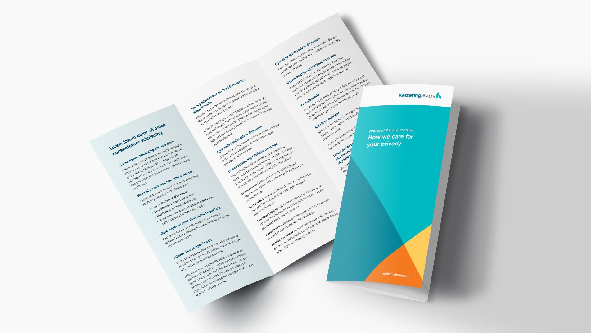
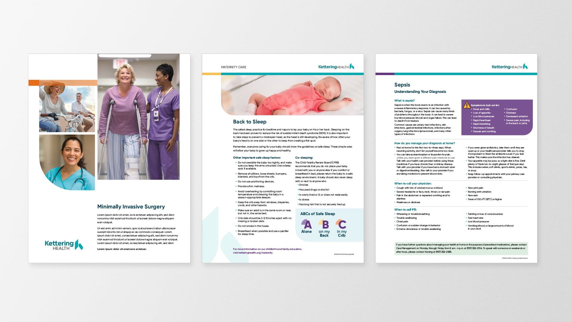
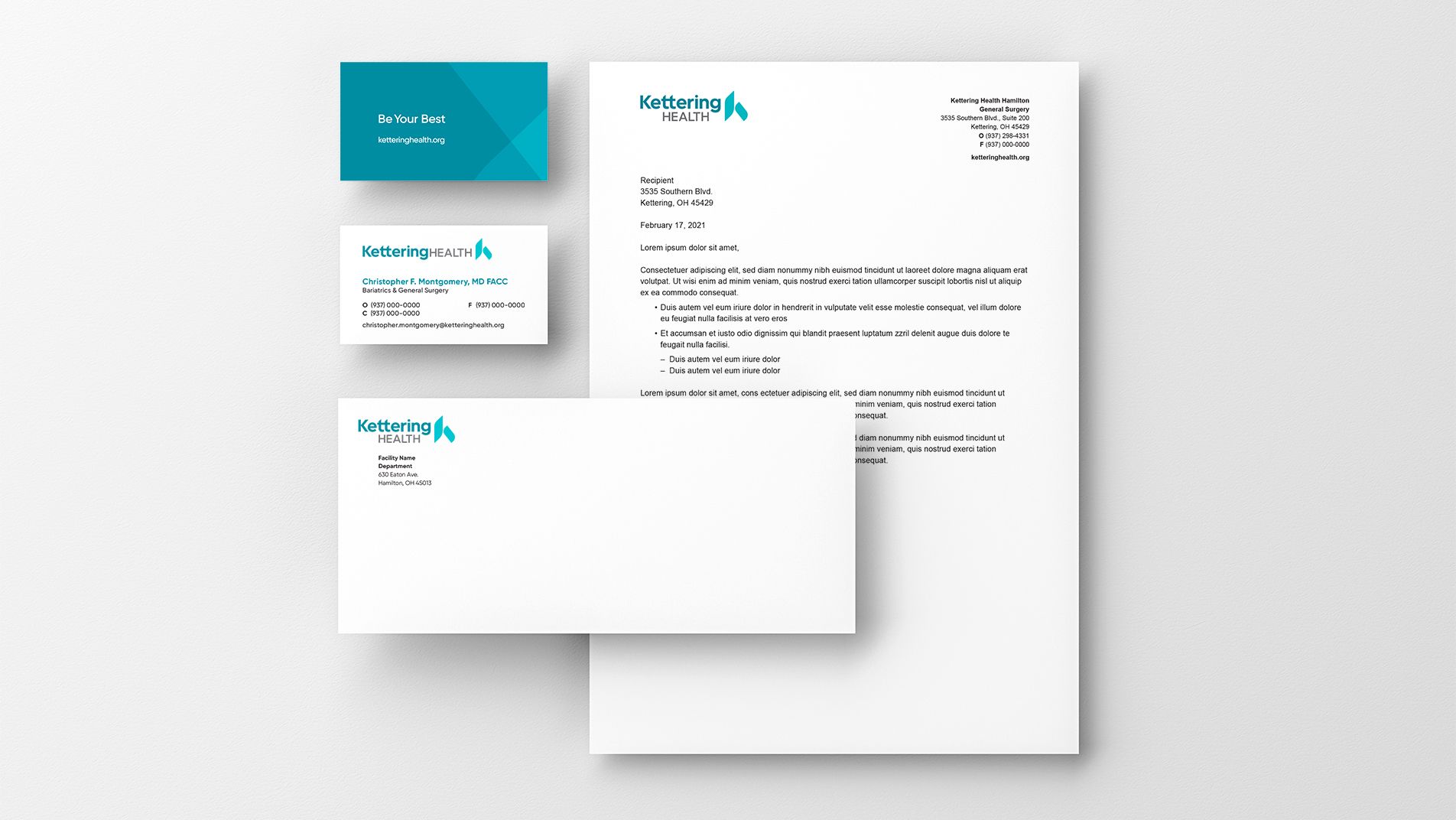
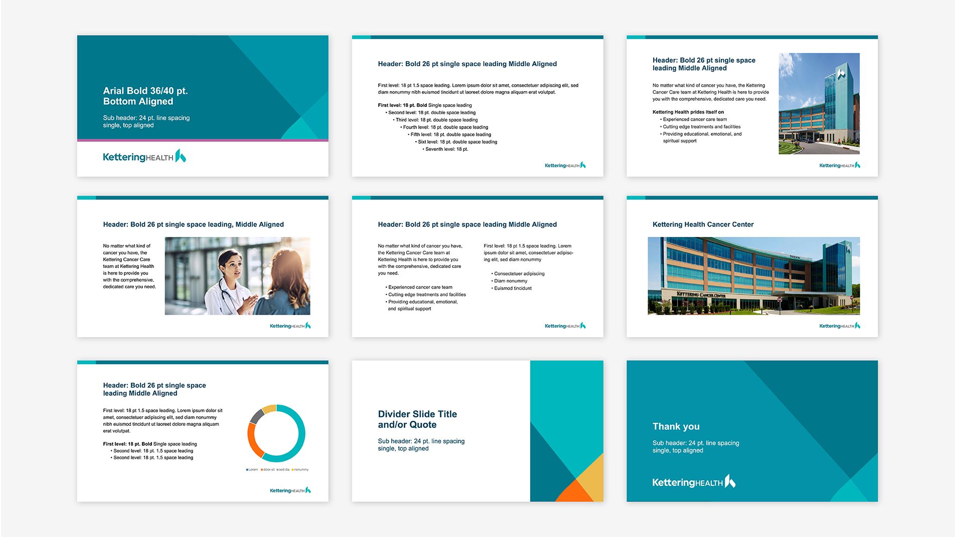
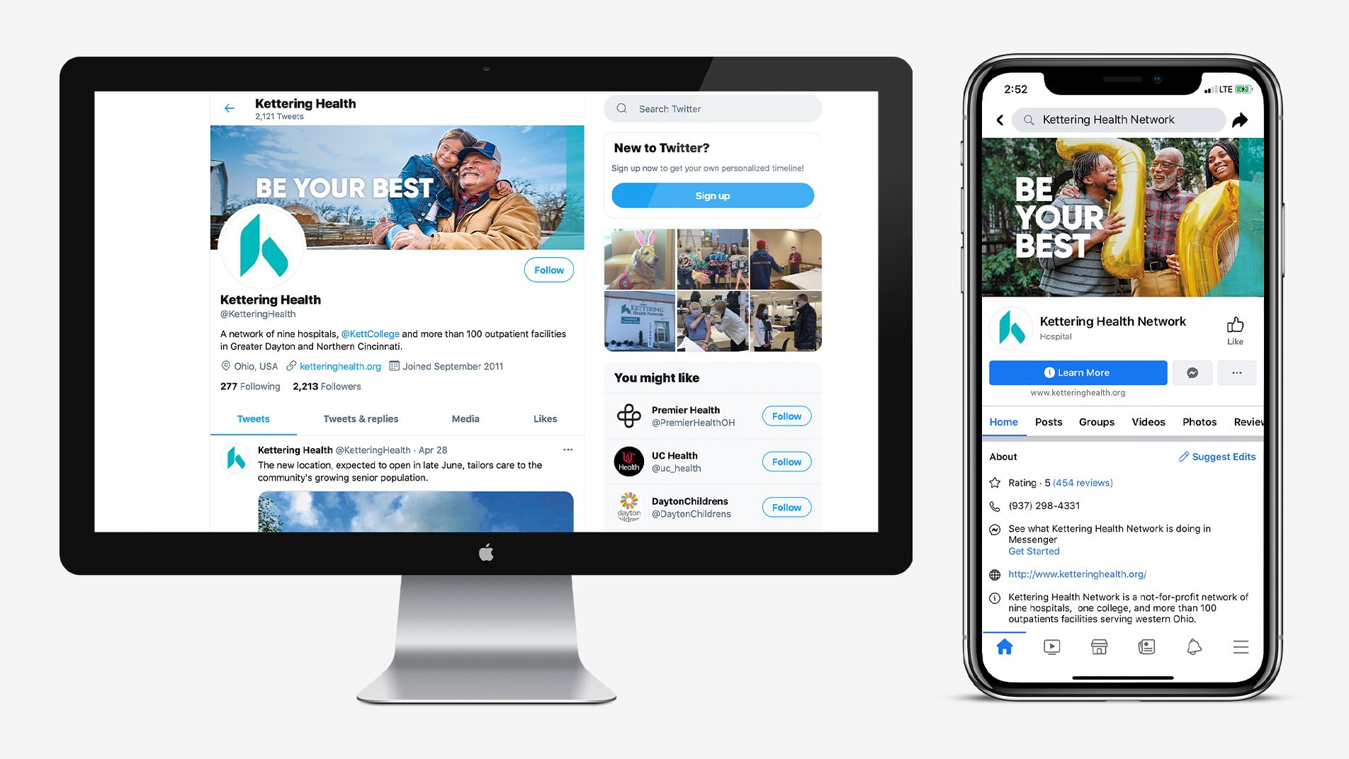
The following demonstrate some of the design templates and collateral materials that are available for customization.


Contact
For any questions regarding brand application, usage, and best practices, please contact Marketing and Communications for solutions and ideas.
MarketingandCommunications@ketteringhealth.org
or call the Marketing mainline: (937) 762-1040
